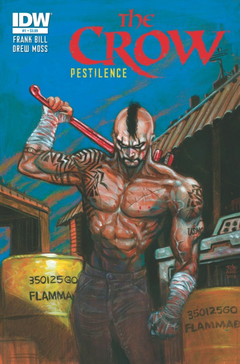
(IDW PUBLISHING, 2013) – Reviewed by Feral Fang
 To me and a few of my good friends, the original Crow collection was an indie bible of sorts – a violent, twisted story with vibrant, black & white artwork that seemed to make every line perfect, whether it be a bit sloppy or loose. It just fit as a package. While there were many other indie titles and collections that I read throughout the years, the original collection still intrigues me (even with the horrid film they made of it). This new title, subtitled “Skinning the Wolves”, is written by Crow creator James O’Barr and the artist Jim Terry, with O’Barr handling the initial breakdowns. So, there is a lot of the older O’Barr style in this, even if just seen through some of Terry’s artwork. A few of the breakdowns really shine through, giving way for some of the classic linework we know from earlier O’Barr artwork. The addition of artist Jim Terry brings a new life to the Crow look (though this version seems to not have the Crow ‘make-up’). The story opens on a Nazi gathering at a train station, unloading the ‘passengers’ to a camp. Somewhere within this we are introduced to a tough guy/badass, who quickly takes out a few Nazi soldiers and is eventually killed. You can see where this is headed, especially as a crow circles the camp before, during, and after the confrontation. This title is pretty well done, though flawed. What I didn’t like about it was the quick pacing and small number of pages. Printed on thicker glossy stock than the usual, the book feels like a full sized story in hand, but reads in all of about 4 minutes, as there really isn’t much to it. If anything, it seems like a preview of the title, as opposed to the first issue. I’m figuring this is mostly due to the thick paper and the short ‘story’/introduction, which leaves me a bit curious as to what issue #2 might hold, yet also a bit annoyed at how little there is in this issue. It really does feel like a back story. I’ll be checking this out as it goes, so I guess we’ll see where it takes it, or doesn’t. I’m totally “eh” on this one but, as stated, I’ll be checking out the 2nd issue, at least. You just never know – Image Comics’ “Happy!” started out with a kinda-crappy first issue and grew into one of my favorite current titles.
2 1/2 out of 5 Snarls
___________________________


